I take up freelances every now and then, here're some of my past work
The Way I See Things
Tuesday, 30 June 2015
Friday, 20 February 2015
Magazine Layout
This is my very first attempt to layout a magazine, I think it worked out pretty well.
My taste is more about simplicity and clean design. Clean design is great, isn't it?
My taste is more about simplicity and clean design. Clean design is great, isn't it?
Wednesday, 17 December 2014
Corporate Identity for ParkAide Mobile
ParkAide is a start-up company that utilizes technology into parking industry with the aim to deliver ultimate conveniences for the users.
Even though it's just a start-up, the board decided to build a sharp and professional brand image.
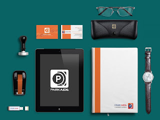
Here're ParkAide brand identity set that I designed for them
Even though it's just a start-up, the board decided to build a sharp and professional brand image.
Here're ParkAide brand identity set that I designed for them
Sunday, 14 September 2014
Digital designs for Pixaworks Creative
I had interned 4 months at Pixaworks creative where I learnt a lot from my Boss and colleague about designs and also Facebook marketing.
It was a very fun experiences to get exposed to Facebook management, Facebook marketing and all that go along with it.
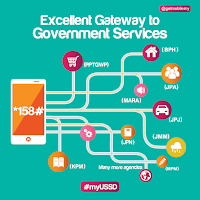
Some poster design for a Government Agency
It was a very fun experiences to get exposed to Facebook management, Facebook marketing and all that go along with it.
 |
| Web design for OHHSOME FEST for HotLink. Too bad my boss rejected it. haha |
Some poster design for a Government Agency
 |
| Poster to enriching Facebook content for Ducatus - Auto mobile oil and lubricant |
Saturday, 17 May 2014
Project ME
I was always wish to have an abstract portrait of myself, but I didn't know how to paint and actually I don't have enough material to do a proper painting .
Then on a very random day, I realized that oh, I can do it on illustrator. So here's my result after 2 days struggling with illustrator and y selfie picture , heheh
Then on a very random day, I realized that oh, I can do it on illustrator. So here's my result after 2 days struggling with illustrator and y selfie picture , heheh
 |
| It look pretty cool without eyes, nose and mouth, isn't it? |
 |
| Reality vs Abstract. |
 |
| This is me. I enjoy myself with a face covered. |
Friday, 18 April 2014
Friday, 4 April 2014
New logo for Light a Life 2.0
Light a Life is a campaign of a gourp of students in HELP University to raise the awareness about Child-Trafficking and to put and end for this crucial act of inhumanity.
So with the ideas of sharing love and light up the children's life,I came up with the new logo for this campaign.
So with the ideas of sharing love and light up the children's life,I came up with the new logo for this campaign.
 |
| Last year Logo |
 |
| The new logo for Light a life |
Subscribe to:
Comments (Atom)


